Free Plus or Minus Comparison Infographic for PowerPoint & Google Slides
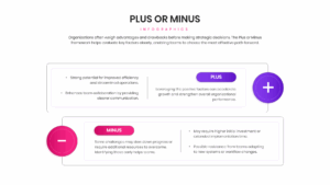
Pros and Cons Infographic Layouts
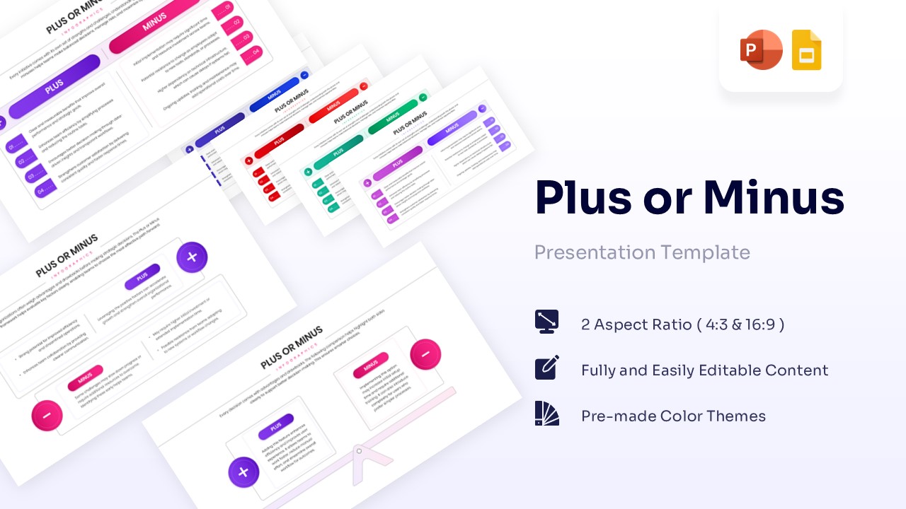
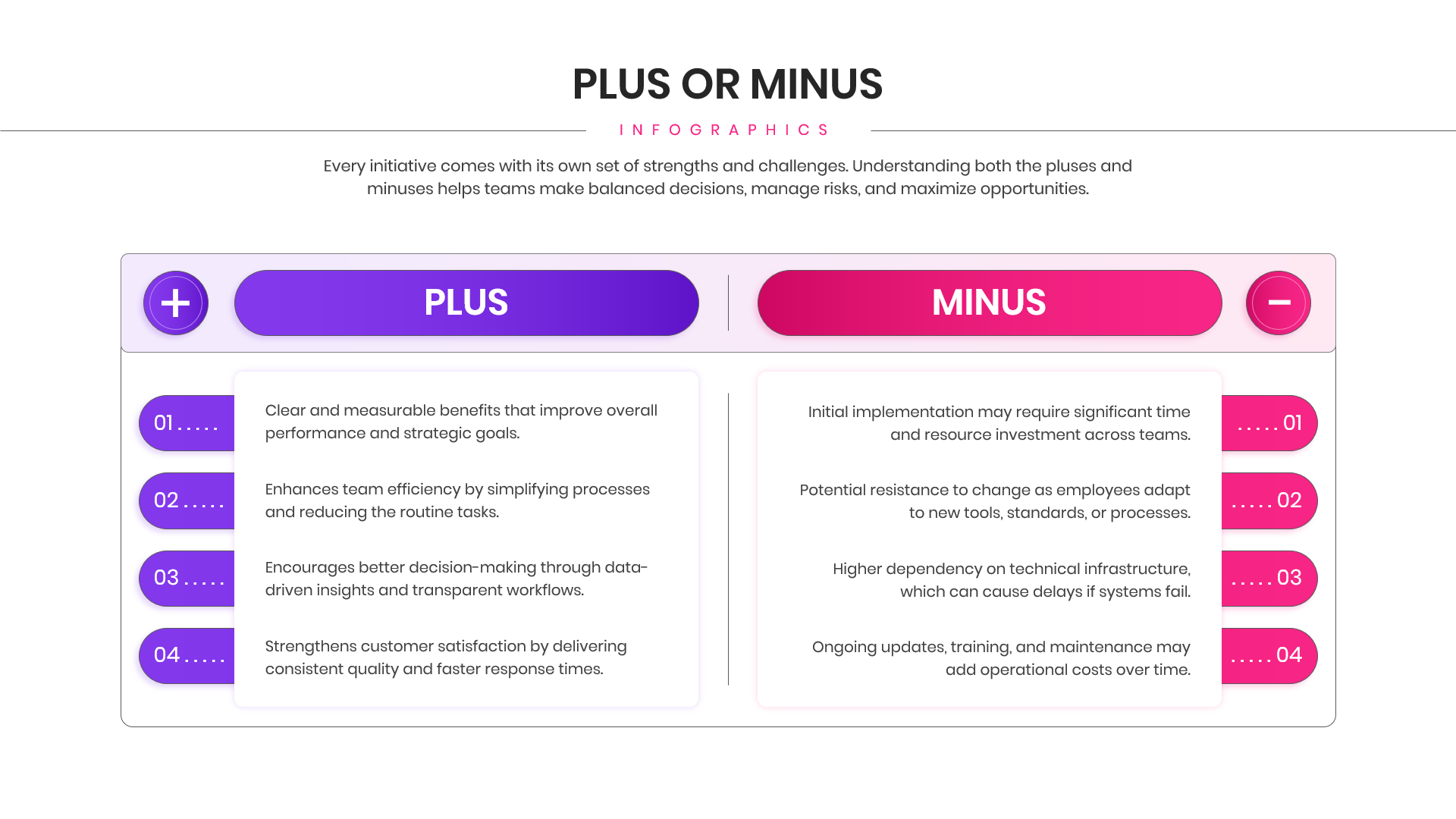
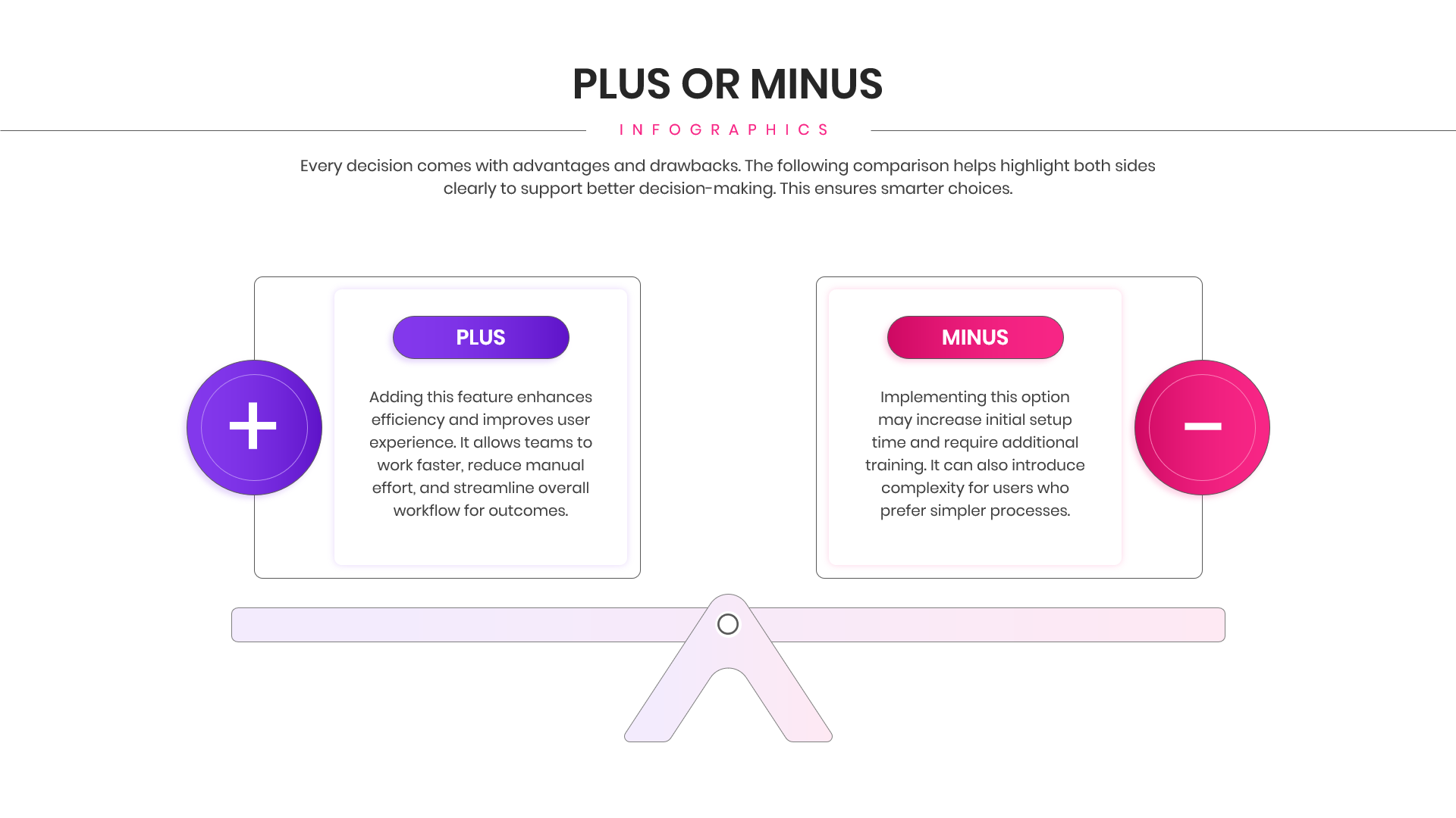
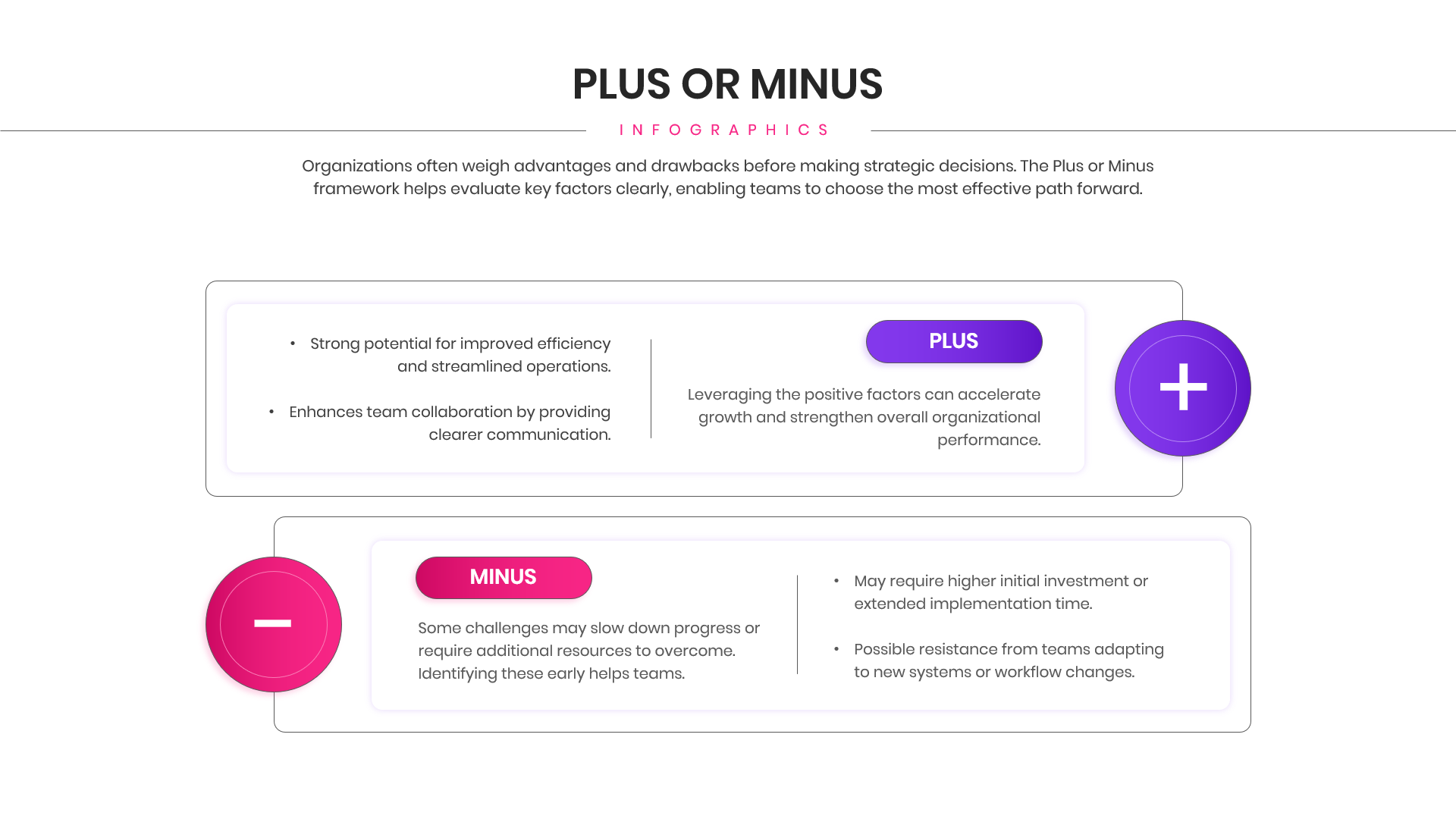
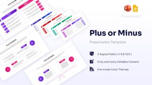
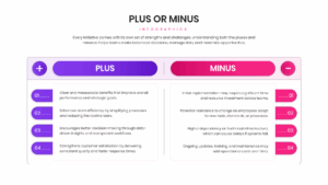
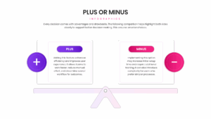
Contrasts opposing strategic factors using a bold purple and pink balance scale graphic alongside clean, side-by-side list blocks. This Plus or Minus comparison infographic helps teams weigh advantages against drawbacks, ensuring complex evaluation metrics are visually digestible for stakeholders. By utilizing distinct color coding, plus and minus iconography, and well-organized text placeholders, this free comparison infographic immediately clarifies the distinction between positive impacts and potential risks.
Delivered in an easily customizable format, this tool is ideal for risk assessments, project proposals, and strategic decision-making presentations where executives need to see both sides of an initiative clearly. Furthermore, it functions exceptionally well for educators or debaters structuring analytical lesson plans to teach students how to objectively evaluate historical events or scientific theories. The professional, modern format integrates seamlessly into high-stakes business decks and educational resources, ensuring your arguments remain balanced and compelling.
Key Features
- 100% Vector-Based Graphics
- Fully Layered & Organized
- 2 Aspect Ratios (4:3 & 16:9)
- Fully Editable Text & Colors
Frequently Asked Questions
- Can I change the colors of the plus and minus buttons?
- Yes, every shape and icon is fully editable, so you can match your company branding.
- Does this work with older versions of PowerPoint?
- Yes, it is compatible with most standard versions of PowerPoint and Google Slides.
- Is the text placeholder easy to update?
- Absolutely, simply click on the text box and type your content; the layout stays intact.
Related Templates
-
 Free
Free -
 Free
Free -
-