Free Net Promoter Score Infographic Template


Net Promoter Score Diagram for PowerPoint and Google Slides
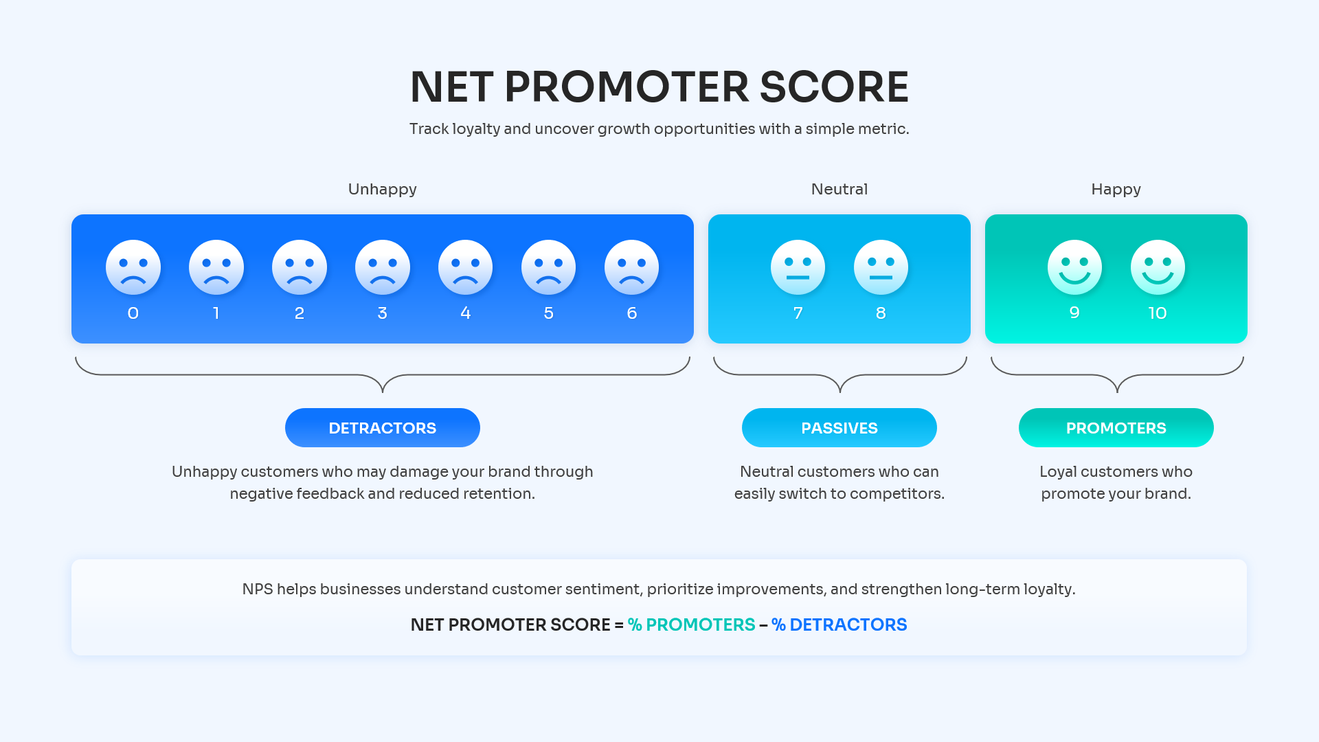
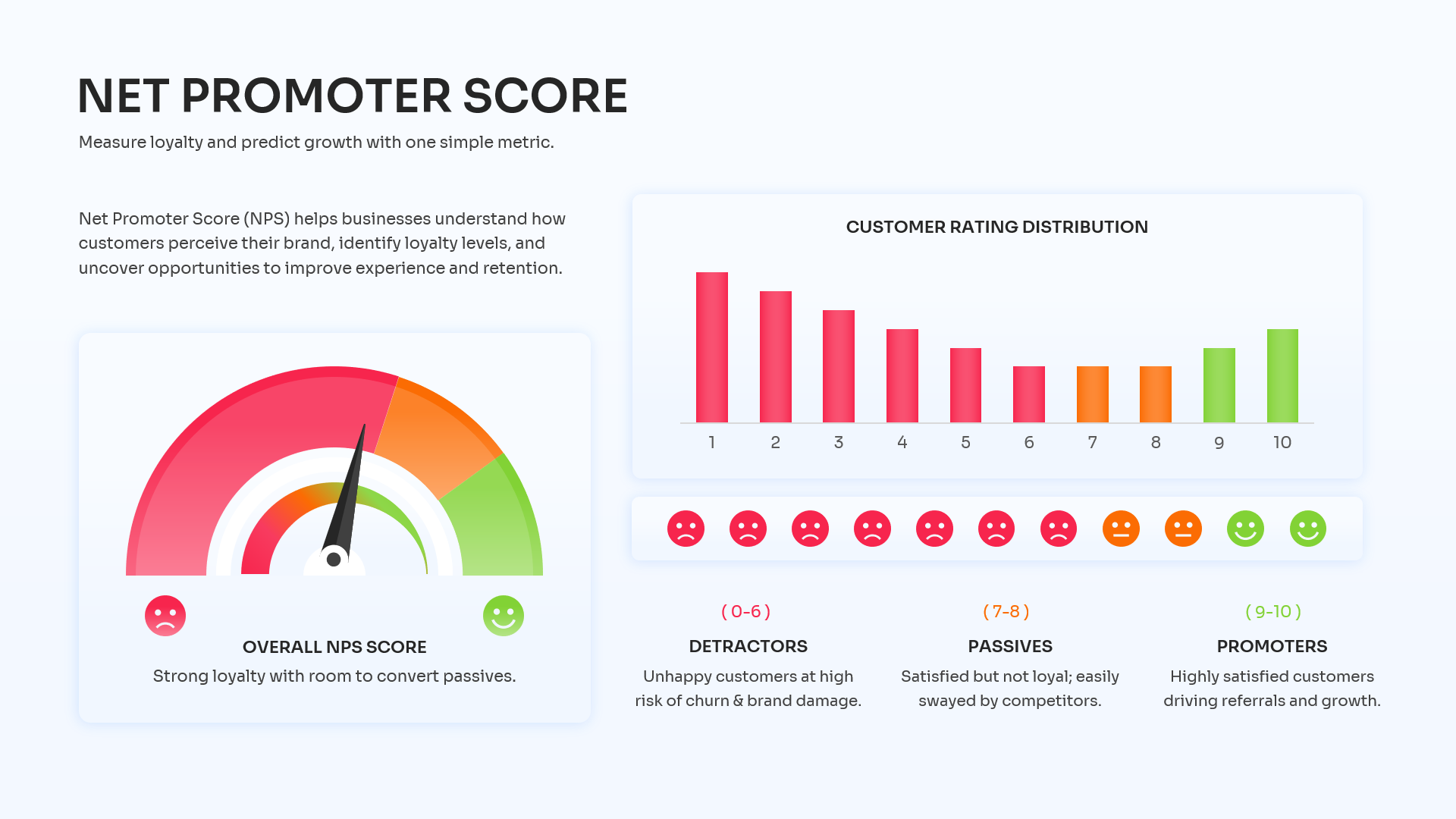
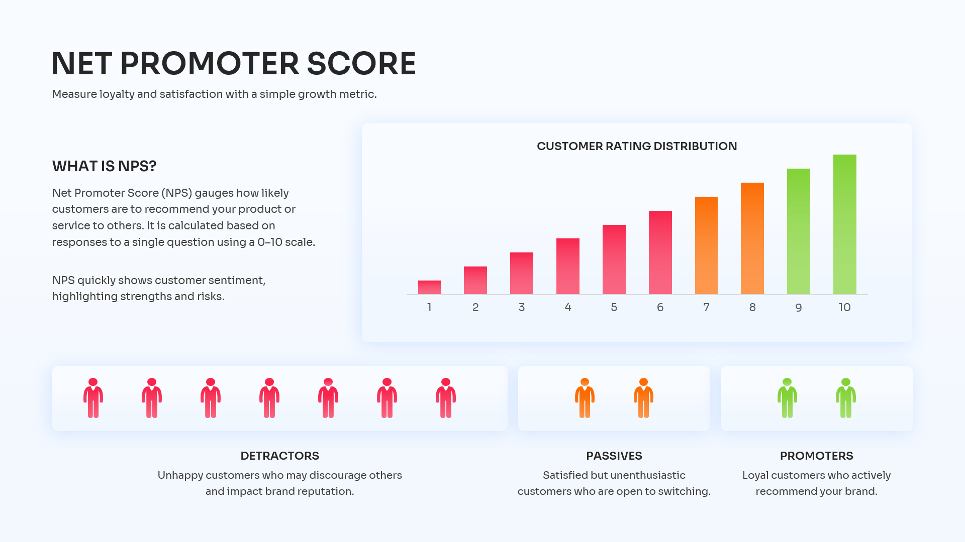
Understanding what your audience truly thinks is a cornerstone of business growth, and mapping out that sentiment shouldn’t be a chore. This Net Promoter Score infographic template translates complex survey data into an incredibly intuitive visual experience. The design relies on a clean, modern aesthetic featuring stark white backgrounds that make the vivid, color-coded elements—like the bright red detractors and vibrant green promoters—pop off the screen. From sleek gauge charts and intuitive smiley face scales to layered bar graphs, every element is designed to clarify your customer feedback loop. We highly encourage you to make this layout your own; you can explore similar ways to present critical data by checking out our business strategy infographics.
Key Features
- 100% Vector-Based Graphics
- Fully Layered & Organized
- Multi-Platform Support
- Theme Color & Theme Font
- Includes 2 Aspect Ratios (4:3 & 16:9)
- Fully Editable Gauge Charts & Rating Scales
Frequently Asked Questions
- How can I edit the gauge chart in this NPS Presentation Slide?
- Everything from the needle to the color bands on the speedometer graphic is a fully editable vector shape. You can simply click on individual segments to change their color, or rotate the needle to accurately reflect your company\'s current score.
- Is this Customer Satisfaction Dashboard compatible with Google Slides?
- Yes, absolutely! Our templates are designed for cross-platform flexibility, meaning you can seamlessly open, edit, and present this layout in Google Slides, PowerPoint, or Apple Keynote without losing any formatting.
Related Templates
-
 Free
Free -
Free Blank Bar Chart Template for PowerPoint & Google Slides
Bar and Column
Free -

Free Waterfall Chart Template for PowerPoint & Google Slides
Bar and Column
Free -