Free Area Chart Template for PowerPoint & Google Slides


Data Visualization Area Charts and Graphs
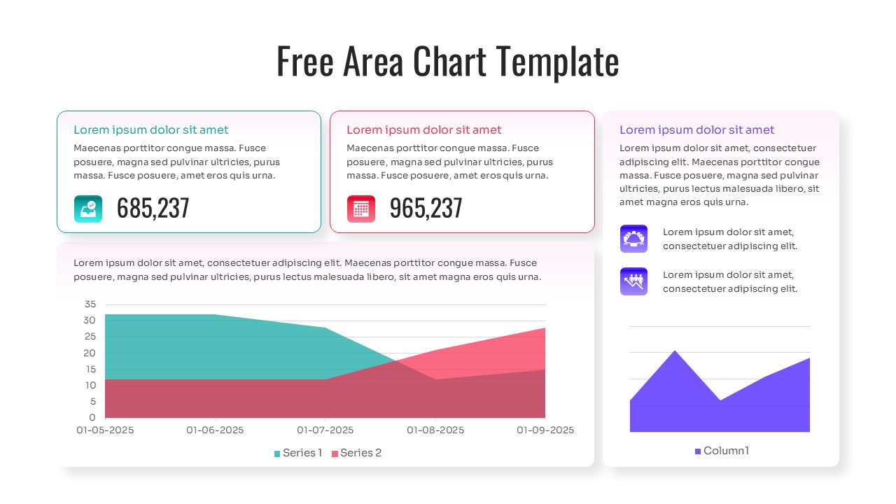
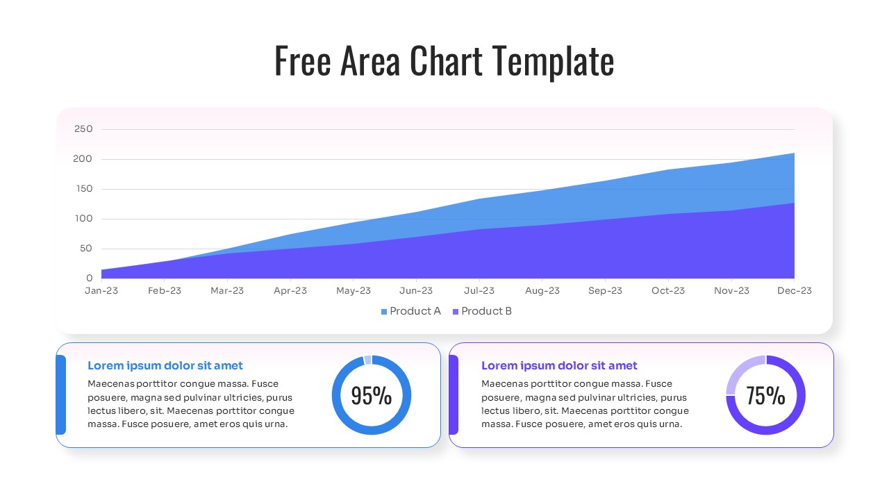
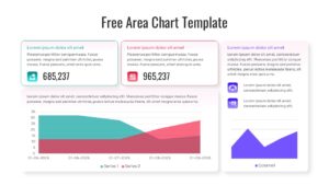
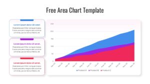
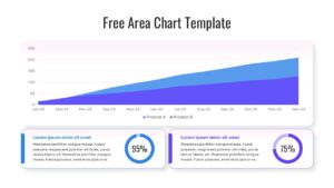
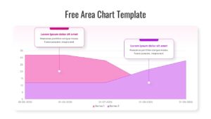
Analyzing quantitative data over time is the backbone of strategic business forecasting and financial reviews. Often, analysts struggle to communicate cumulative totals and trend shifts without overwhelming stakeholders with raw numbers or cluttered spreadsheets. Effective data representation relies on clear axes, color-coded volume distinctions, and legible trend lines to showcase volume and capacity across distinct periods. With this Free Area Chart Template, visually articulate complex volume trends and cumulative data with absolute clarity. The vivid color overlays, gradient fills, and crisp typography transform numerical updates into engaging stories, preventing audience fatigue. This collection offers clean, vibrant layouts that allow you to highlight specific trends, compare multiple categories, and keep your stakeholders entirely focused. Incorporate these intuitive visuals alongside a comprehensive free strategic business overview deck to ensure your quantitative findings are both persuasive and memorable.
Key Features
- 100% Vector-Based Graphics
- Fully Layered & Organized
- Multi-Platform Support
- Theme Color & Theme Font
- Easily Editable Data Series
- High-Resolution Professional Layouts
Frequently Asked Questions
- How do I edit the data in these area charts?
- You can easily update the charts by right-clicking the graph and selecting \"Edit Data,\" which allows you to input your numbers directly into an integrated spreadsheet.
- Can I change the colors to match my brand?
- Yes, the template uses theme colors, so you can change the entire color palette with just a few clicks in the design tab of PowerPoint or Google Slides.
- Is this template compatible with Keynote?
- While designed for PowerPoint and Google Slides, you can import the .pptx file into Keynote, though some minor formatting adjustments might be needed.
Related Templates
-
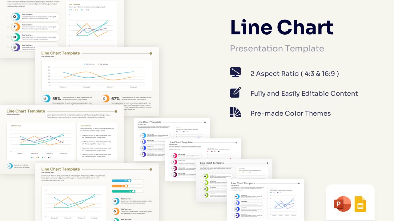
Free Line Chart Template for PowerPoint & Google Slides
Charts & Graphs
Free -
 Free
Free -
 Free
Free -