Free Radial Gauge Chart Template for PowerPoint & Google Slides
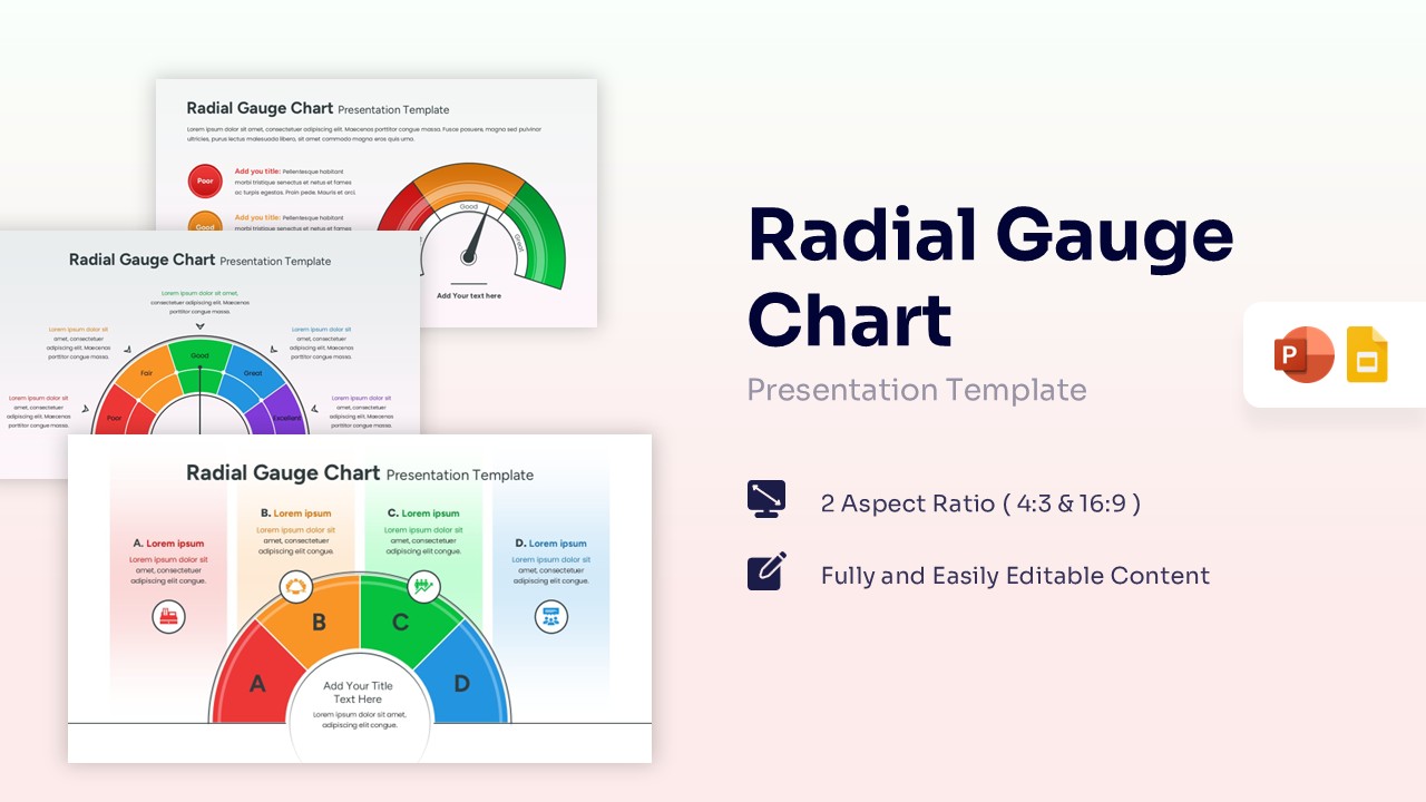


High-Impact KPI Dashboard Visualization
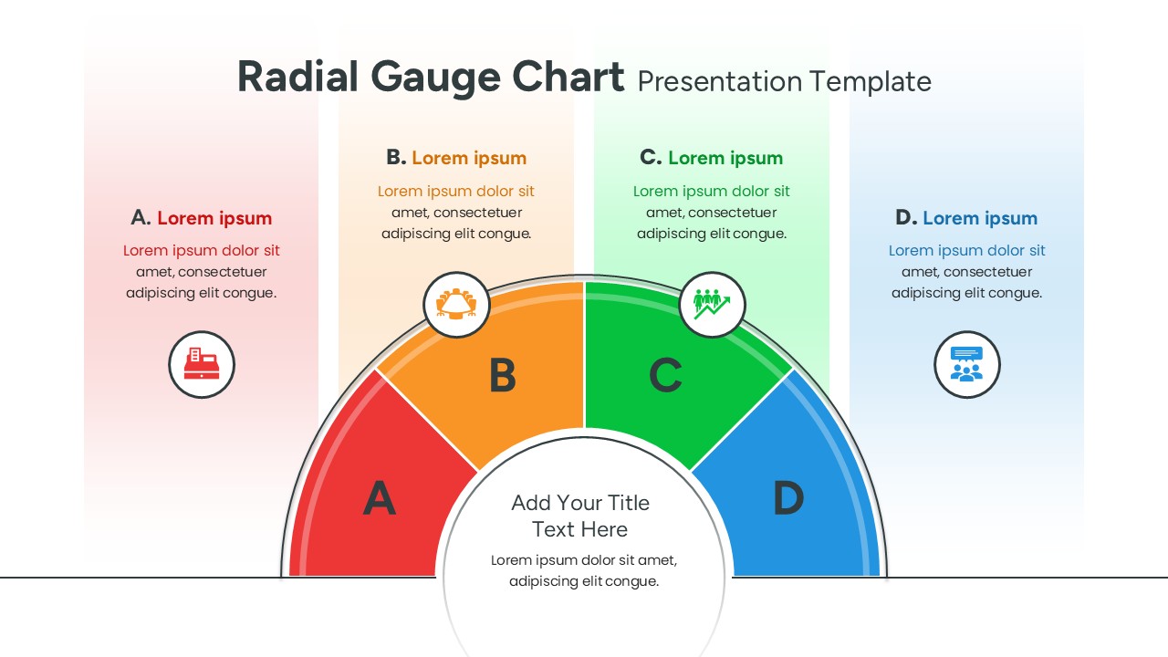
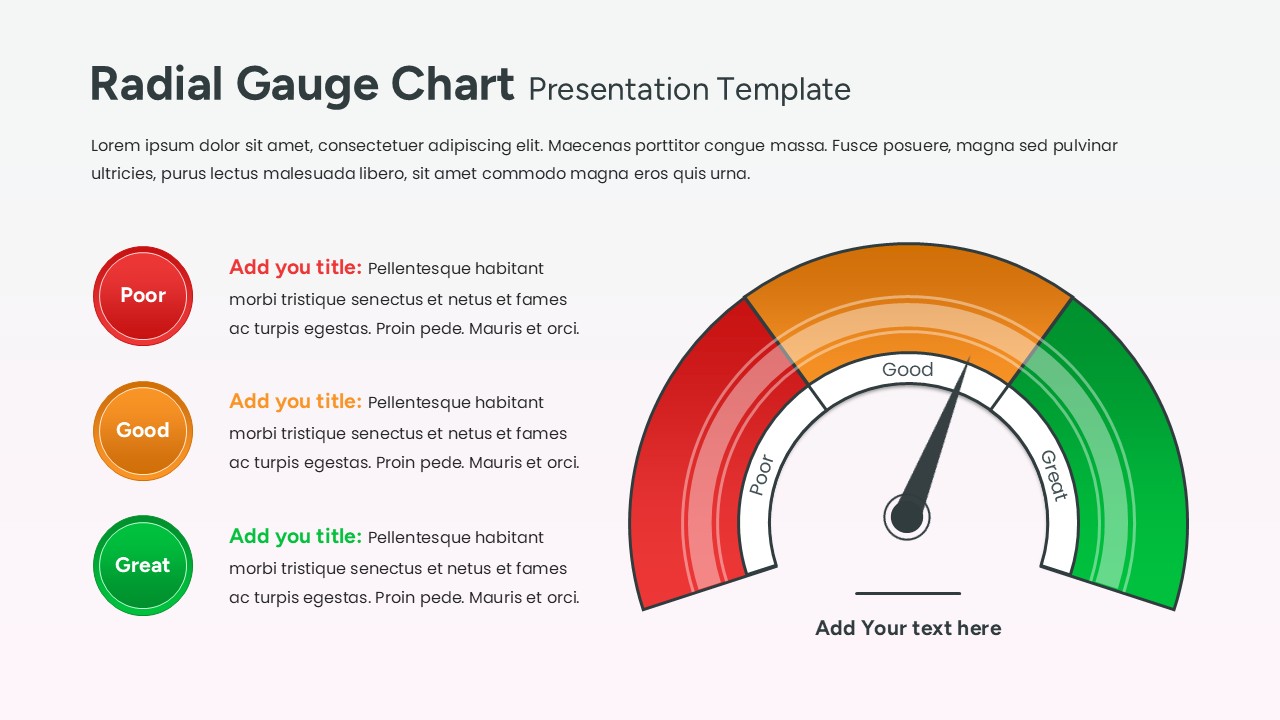
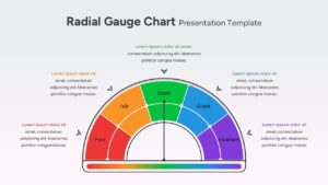
This Free Radial Gauge Chart Template, highlights the dynamic versatility of a radial gauge, showcasing a diverse range of performance indicators to help you track project health with precision. This chart design template uses a clean and modern, featuring a dark-themed aesthetic that makes data points pop with vivid lime and cyan accents. It uses a high-contrast color palette of deep charcoal and electric lime, ensuring your audience stays focused on the most critical numbers. We encourage you to transform your data into a compelling visual narrative using our extensive infographics category collection.
Leverage these vibrant, speedometer-style layouts to tell a memorable story about your company’s growth or operational efficiency. Editing is a breeze—simply click to modify text boxes, swap headers, or update data values to fit your specific reporting needs in seconds. You can easily apply your unique personal touch by adjusting the font styles or switching color palettes to align with your organization’s brand identity. Feel free to explore more data-driven dashboard layouts to complement your deck.
Key Features
- 100% Vector-Based Graphics
- Fully Layered & Organized
- Multi-Platform Support
- Theme Color & Theme Font
Frequently Asked Questions
- How do I change the position of the needle?
- The needle is a vector element; simply click on it and use the rotation handle to point it toward your desired data segment.
- Can I change the colors of the gauge segments?
- Yes, every segment is a separate shape. You can use the \"Shape Fill\" tool to match your specific brand colors or status meanings.
- Is this template compatible with widescreen monitors?
- Absolutely. This pack includes both 4:3 and 16:9 aspect ratios to ensure your charts look great on any screen or projector.
Related Templates
-
 Free
Free -
 Free
Free -
-
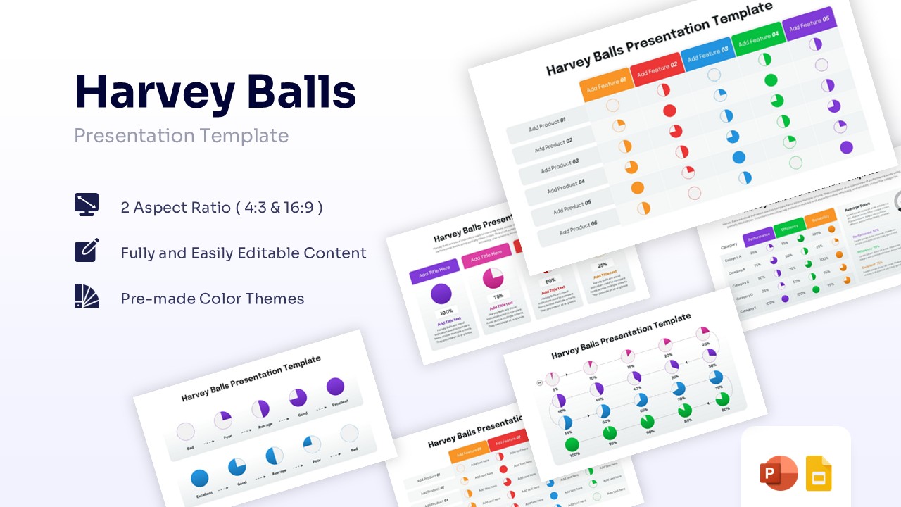
Harvey Balls Diagram Presentation Template
Charts & Graphs
Free