Free Sankey Diagram Template for PowerPoint & Google Slides


Flow Visualization Slides for Process Mapping
About This Template
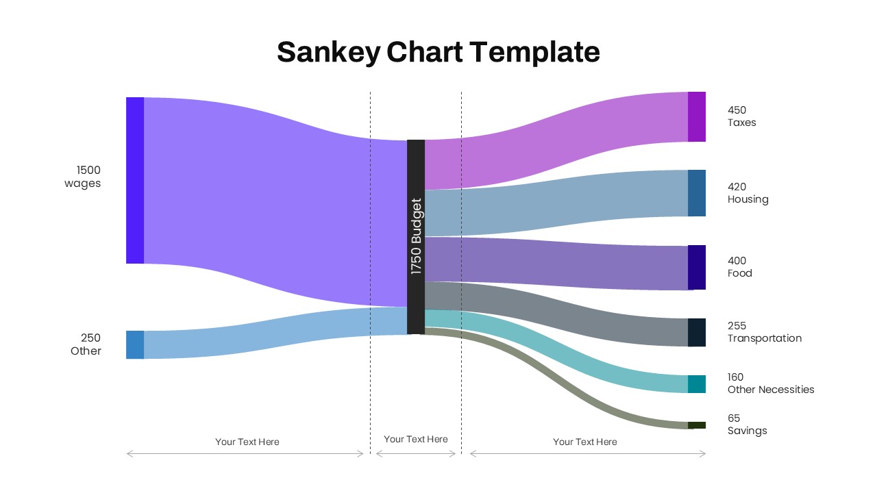
The Free Sankey Chart Template visualizes resources, budgets, energy, information, and operational processes. Structured Sankey diagrams simplify complex relationships and improve audience understanding. The template is fully editable in PowerPoint and Google Slides. It supports business reporting, financial analysis, and strategic planning presentations.
Template Contents
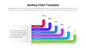
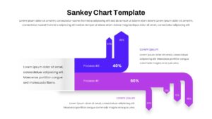
This presentation includes Sankey charts, flow diagrams, percentage indicators, and allocation visuals. The layouts show how values move between sources and destinations. Each slide simplifies complex datasets through clear visual pathways. Shapes, colors, icons, text, and flow connections are fully editable. Explore our Process Flow PowerPoint Templates for additional workflow and operational visualization slides.
Features & Applications
The template includes fully editable Sankey chart diagrams, resource allocation visuals, and process flow layouts. It also features percentage-based data flow infographics and customizable design elements. This template supports financial reporting, workflow optimization, and customer journey mapping. It is useful for supply chain analysis and energy distribution studies. Consultants, analysts, managers, and executives can present data with greater clarity.
Presentation Benefits
The purple color palette creates a professional and modern appearance. Structured flow pathways improve readability and audience engagement. Clear visual hierarchy highlights important data relationships and outcomes. The layouts support effective storytelling and executive-level communication. Explore our Data Visualization PowerPoint Templates for dashboards, charts, KPI slides, and reporting layouts.
Compatibility
The Sankey Chart Template works seamlessly with PowerPoint and Google Slides. Users can edit diagrams, labels, colors, and content without formatting issues. The template supports easy customization across different presentation environments.
Key Features
- 100% Vector-Based Graphics
- Fully Layered & Organized
- Multi-Platform Support
- Theme Color & Theme Font
- Editable Sankey Flow Diagrams
- Percentage-Based Process Flow Infographics
Frequently Asked Questions
- What is a Sankey Diagram PowerPoint used for?
- A Sankey Diagram PowerPoint is used to visualize the flow of resources, energy, budgets, information, or processes by showing proportional relationships between inputs and outputs.
- Can I edit the flow values and colors in this Sankey Chart Template?
- Yes. All flow paths, labels, percentages, colors, and text elements are fully editable in both PowerPoint and Google Slides.
- Who should use a Process Flow Infographic presentation?
- Business analysts, project managers, consultants, financial teams, operations managers, and executives can use these visuals to explain complex flow relationships clearly.
Related Templates
-
-
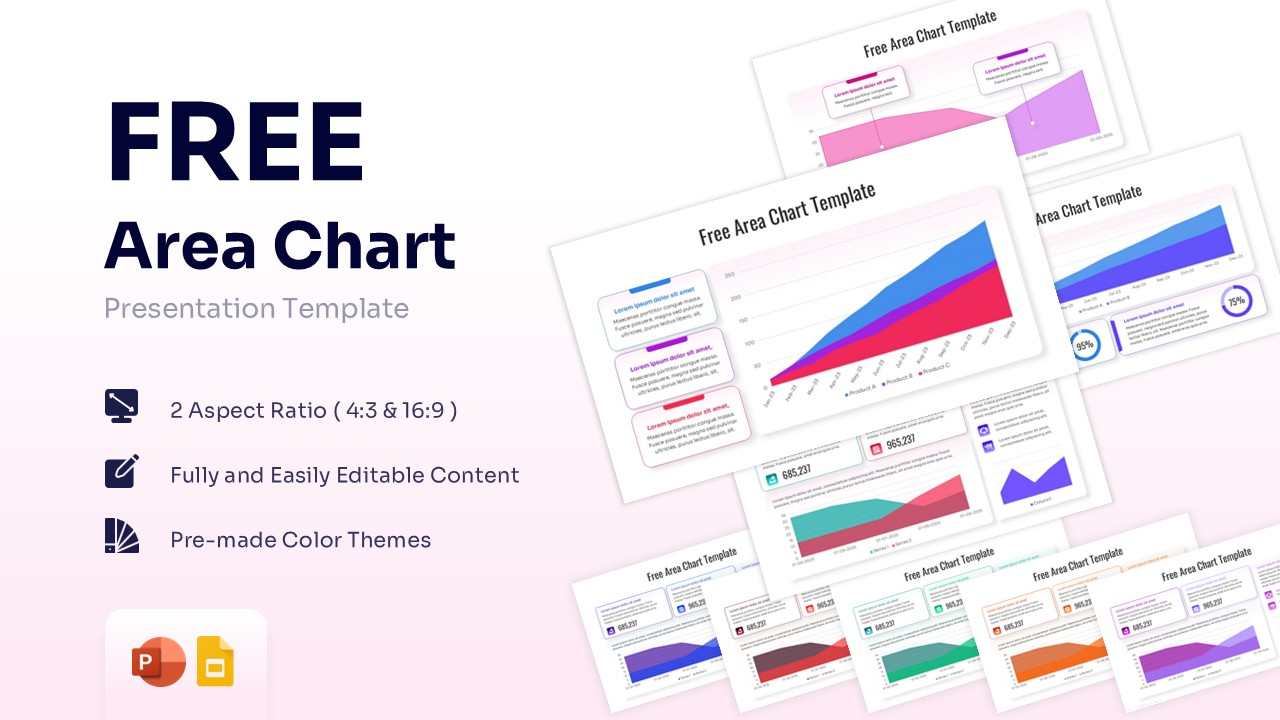
Free Area Chart Template for PowerPoint & Google Slides
Charts & Graphs
Free -
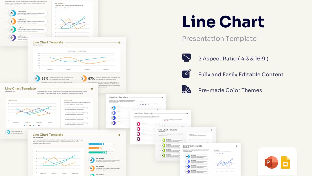
Free Line Chart Template for PowerPoint & Google Slides
Charts & Graphs
Free -