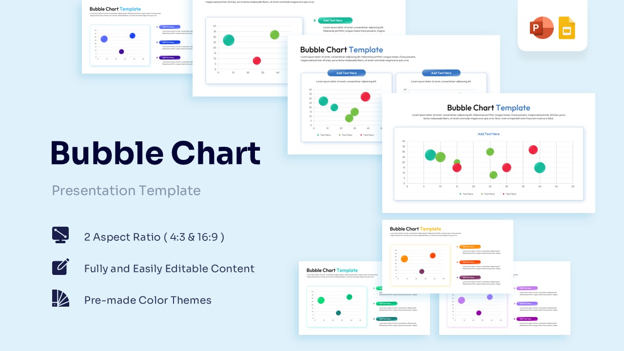
Bubble Chart Template for PowerPoint & Google Slides
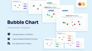

Data Visualization Bubble Chart Slides for Strategic Analysis
Technical Details: This PresentoVerse Bubble Chart Template is available to download and use. Moreover, it can be seamlessly edited on Microsoft PowerPoint and Google Slides. Explore related layouts through business data visualization chart templates.
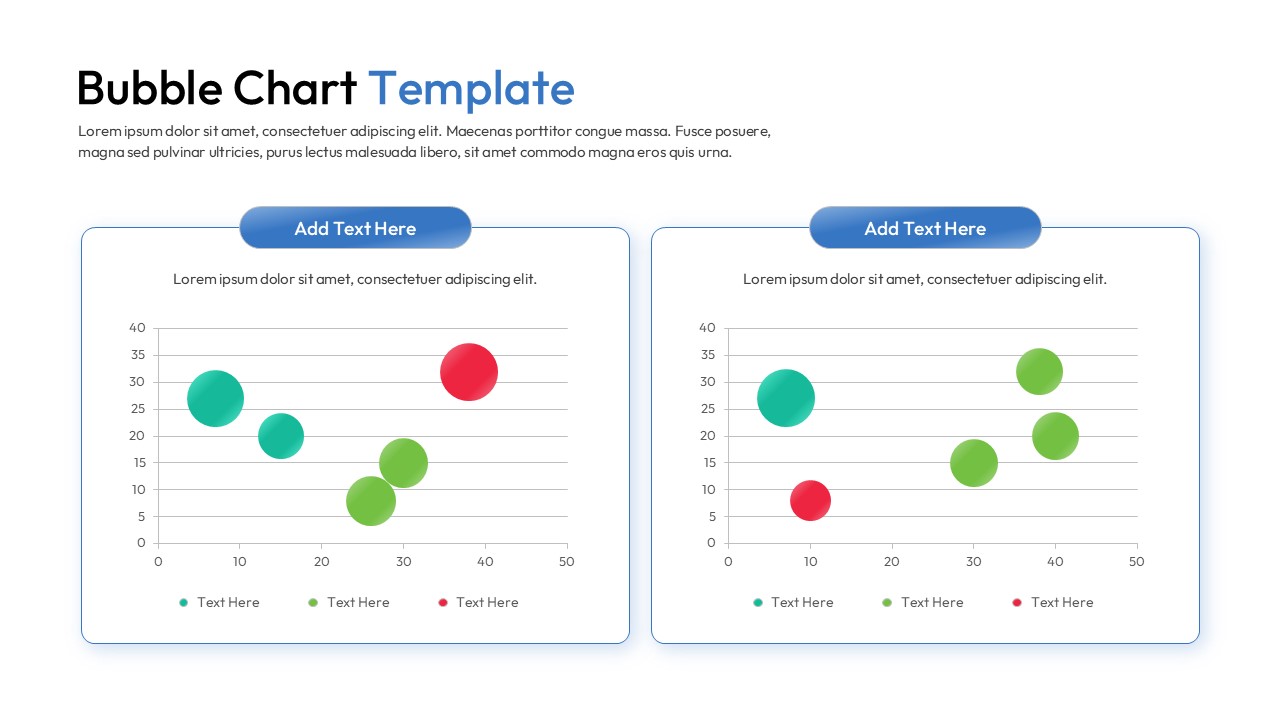
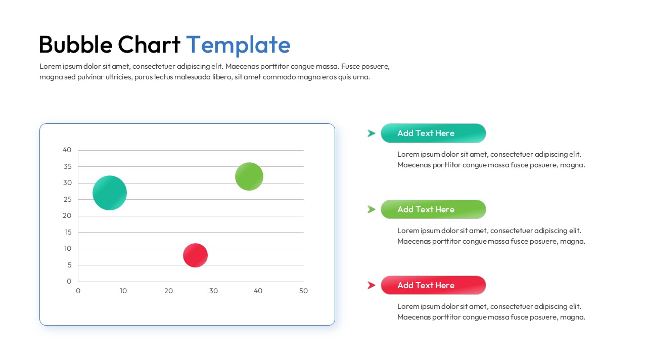
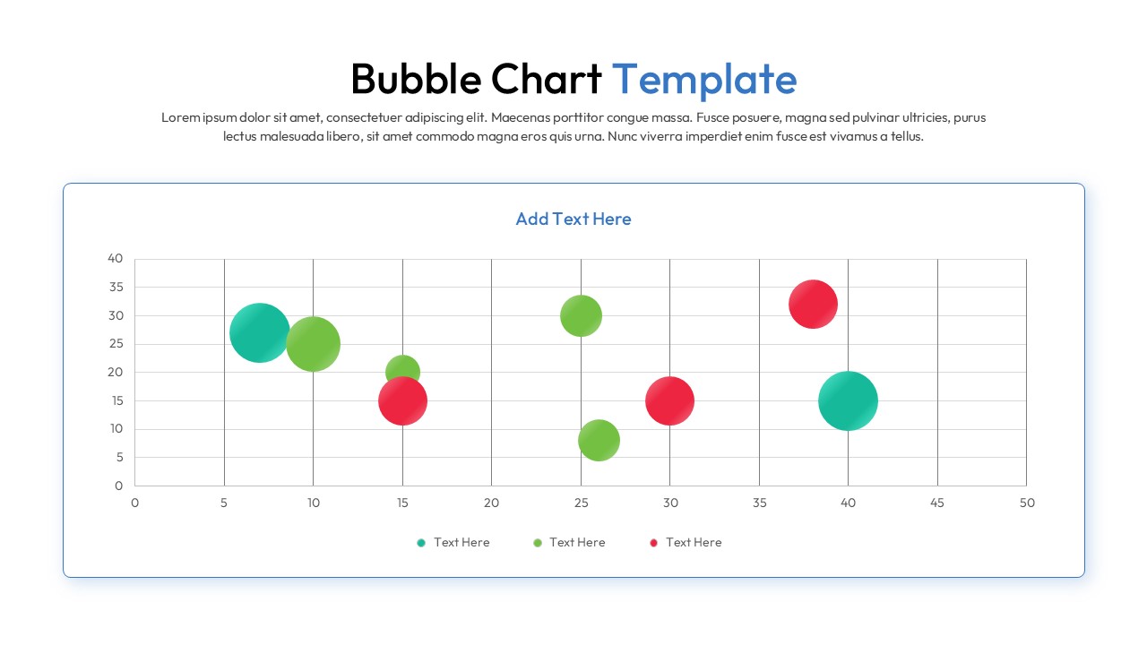
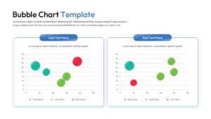
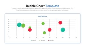
Content Strategy: Bubble charts help present relationships between multiple variables in a single visual. This layout allows users to compare trends, analyze performance metrics, and communicate data-driven insights effectively.
Visual Elements: The design uses blue, green, red, and teal color palettes with modern sans-serif typography. Bubble graphs, comparison layouts, legends, and data-focused visuals enhance analytical storytelling.
Recommended Usage: Ideal for analysts, consultants, marketers, and business teams presenting performance data. Pair it with dashboard and KPI presentation templates for reporting and strategic decision-making.
Key Features
- 100% Vector-Based Graphics
- Fully Layered & Organized
- Multi-Platform Support
- Theme Color & Theme Font
- Adjustable bubble sizes and positions
- Clean coordinate grid for precise value mapping
Frequently Asked Questions
- Can I change the size of individual bubbles in this scatter bubble diagram?
- Yes, every bubble is an independent vector shape. You can click on any circle and drag the corner handles to change its size to reflect your specific data values.
- How many data categories can I represent in this metric visualization layout?
- While the default slides show three to four categories using different colors, you can easily duplicate or delete bubbles to match the number of data series in your report.
- Is the coordinate grid editable in these multivariate data slides?
- Absolutely. You can modify the axis labels, change the scale increments, and adjust the grid lines using the standard shape and text tools in PowerPoint or Google Slides.
Related Templates
-
-
 Free
Free -
 Free
Free -
Free Line Chart Template for PowerPoint & Google Slides
Charts & Graphs
Free